
Wind
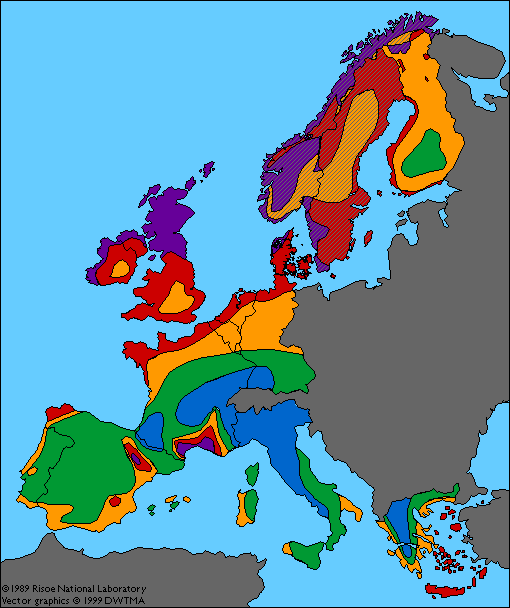
Map of Western Europe
|
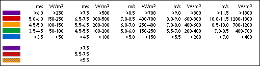
Wind Resources at 50 (45) m Above Ground Level |
|||||||
|
|
Sheltered terrain |
Open plain |
At a sea coast |
Open sea |
Hills and ridges |
||
How
to Read the Wind Map of Western Europe
This wind map of Western Europe was originally published as part
of the European Wind Atlas.
The details on how to interpret the colours are given in the
legend above. Please note that the data for Norway, Sweden and
Finland are from a later study, and are calculated for 45 m height
above ground level, and assume an open plain.
![]() The purple zones are the areas with the strongest
winds while the blue zones have the weakest winds. The dividing
lines between the different zones are not as sharp as they appear
on the map. In reality, the areas tend to blend smoothly into
one another.
The purple zones are the areas with the strongest
winds while the blue zones have the weakest winds. The dividing
lines between the different zones are not as sharp as they appear
on the map. In reality, the areas tend to blend smoothly into
one another.
![]() You should note, however, that the colours
on the map assume that the globe is round without obstacles
to the wind, speed up effects, or varying
roughness of the terrain. You may therefore
easily find good, windy sites for wind turbines on hills and
ridges in, say the yellow or green areas of the map, while you
have little wind in sheltered terrain in the purple areas.
You should note, however, that the colours
on the map assume that the globe is round without obstacles
to the wind, speed up effects, or varying
roughness of the terrain. You may therefore
easily find good, windy sites for wind turbines on hills and
ridges in, say the yellow or green areas of the map, while you
have little wind in sheltered terrain in the purple areas.
The
Power of the Wind
In case you cannot explain why the calculated mean power of the
wind in the table is approximately twice the power of the wind
at the given mean wind speed, you should read the four to six
pages starting with the Weibull Distribution.
Reality
is More Complicated
Actual local differences in the terrain will mean that the picture
will be much more complicated, if we take a closer look. As an
example, we will now take a closeup view of Denmark on the next page.
![]()
|
Back | Home
| Forward |
© Copyright 1999 Soren Krohn
Updated 6 August 2000
http://www.windpower.org/tour/wres/euromap.htm